
A Wellness Brand Built From the Brief Up
Client
SÒMA.
Year
2026
Industry
Wellness/Lifestyle
Host Platform
Framer
SÒMA. is a self-initiated concept project built to show how a functional wellness shot brand could feel premium, intelligent, and emotionally resonant.
ÉCLOVA developed the brand from scratch, shaping everything from naming and visual identity through to the full website structure to create a complete digital experience designed to feel launch-ready.
The design direction is intentionally unexpected for the wellness space, warmer, more editorial, less clinical. Typography is expressive without being loud. Color pulls from the product itself. The result is a brand that feels premium without feeling cold, and a site that moves the way the product promises to make you feel.
Scope of Work

A Fictional Wellness Brand With Real-World Depth
SÒMA started with a simple question:
What would a wellness brand look like if it felt thoughtful rather than trendy?
There was no existing company, product line, packaging, photography, website, or content strategy to build from. Everything had to be created from the ground up, from the formulas and visual identity to the customer journey and digital experience.
What emerged was more than a website. SÒMA. became a fully realized concept brand complete with a product system, editorial content, subscription model, ingredient education, waitlist flow, and a digital experience designed to feel ready for market.
The project became an exercise in building belief: taking an idea that didn't exist and making it feel like it could.
More Than a Website
The objective was never to create a beautiful landing page.
SÒMA. needed enough depth that someone discovering the brand for the first time could understand what it was, why it existed, how the products differed from one another, and what might persuade them to join the waitlist. That meant thinking beyond individual screens.
The identity, product structure, copy, interactions, content system, and conversion flow all needed to support the same story. Every touchpoint had to reinforce the feeling that SÒMA. was a real brand with a clear point of view, rather than just a visual exercise.
The Challenge
Based on research, many wellness brands seem to communicate in extremes. Some lean heavily into science and end up feeling cold and clinical. Others focus so much on lifestyle and aspiration that the product itself becomes difficult to understand. And SÒMA. needed to find a middle ground.
The brand had to feel informed without becoming technical, premium without becoming exclusive, and emotionally engaging without relying on vague wellness language. Because the project was self-initiated, every foundational decision had to be made from scratch: the positioning, product architecture, naming system, visual identity, user experience, content strategy, and interaction design.
The challenge wasn't simply designing a product website.
It was creating enough structure around the idea that the product felt believable. Building trust with the user without over-explaining. Making the experience feel premium, polished, and editorial while still being conversion-focused. Giving the concept operational depth to make the brand feel ready for market.
Organizing Wellness Around Intent
Rather than leading with ingredients, SÒMA. was built around outcomes.
The product line was divided into four formulas: Focus., Calm., Rise., and Restore.; each representing a state someone might want to move toward throughout the day. This approach created a simpler decision-making process for the customer. Visitors don't arrive thinking about adaptogens, amino acids, or botanical extracts. They arrive wanting more clarity, more energy, less stress, or better recovery. And the website reflects this reality by introducing the desired outcome first and highlighting the supporting ingredients second.
Formula System
Formula | Role | Experience |
|---|---|---|
Focus. | Clarity, attention, mental stamina | Sharp, bright, steady |
Calm. | Ease, balance, nervous system support | Warm, grounded, soft |
Rise. | Energy, motivation, daily momentum | Uplifting, active, fresh |
Restore. | Rest, recovery, evening reset | Deep, slow, restorative |
The Signature Interaction
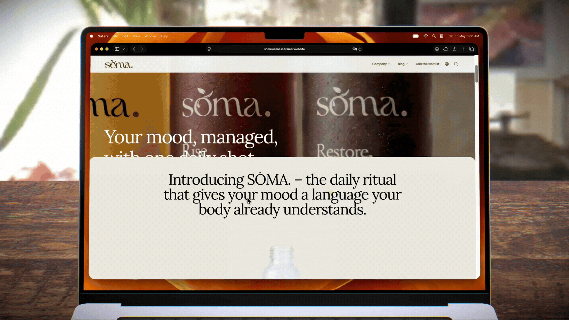
One of the earliest ideas developed for the project became the defining interaction of the site.
As visitors scroll through the introduction, the bottle gradually fills with liquid. It's a simple mechanic, but it changes how the product is experienced. Rather than appearing as a static object on the page, the bottle becomes part of the narrative itself. The interaction also mirrors the brand's core idea: small actions repeated consistently create meaningful change over time.
More importantly, it creates a memorable moment early in the journey, something that helps distinguish SÒMA. from the countless wellness websites built around standard product grids and feature lists.
Purpose: To create a memorable opening moment that immediately separates the experience from a typical product landing page.
Function: To use motion to introduce the product through feeling, pacing, and visual transformation.
Effect: To make the brand feel immersive and premium without sacrificing clarity.
Identity Direction
SÒMA.’s identity was built to feel calm, intelligent, and refined. Serif typography gives the brand an editorial softness, while muted formula colors create distinction across the product line without disrupting the overall sense of restraint.
The brand avoids the loud neon language often found in functional beverages and the overly clinical minimalism common in supplement brands. Instead, SÒMA. takes a more elevated, warm, and composed approach. However, the goal wasn't to make the brand look luxurious, but rather to make it feel considered.
Identity Highlights
Editorial serif typography using the Lora font creates warmth, sophistication, and a slower visual rhythm.
Muted botanical tones in the color palette support the formulas while keeping the brand world cohesive.
Minimal bottle labels allow each formula color to become part of the product experience.
Soft lifestyle imagery, product-led compositions, and spacious layouts create a premium wellness atmosphere.
The copy balances emotional clarity with grounded product education.
Designing the Journey
The UX was designed around progressive disclosure. Rather than forcing visitors to absorb every detail at once, the site introduces information in layers. Visitors are first introduced to the feeling of the brand before they're asked to evaluate the product itself. As they continue, each section answers a different question.
What is SÒMA?
Who is it for?
Which formula is right for me?
What's inside it?
How does it fit into my routine?
By the time pricing section appears, visitors have already been given enough context to understand the value proposition.
Each section has a clear role in the journey which includes building curiosity, trust, and intent as the visitor moves through the page.
Journey Overview
Atmosphere: Establishes the tone of the brand.
Product Introduction: Explains what SÒMA. is and why it exists.
Formula Discovery: Helps visitors choose based on the state they want to support.
Ingredient Education: Builds trust through structured, digestible information.
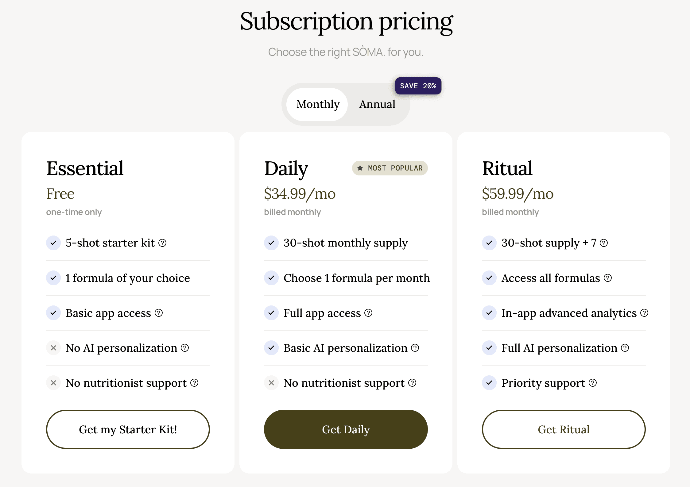
Subscription Logic: Presents pricing in a familiar, conversion-ready format.
Waitlist Conversion: Captures interest with a simple, focused launch CTA.
Beyond the Homepage
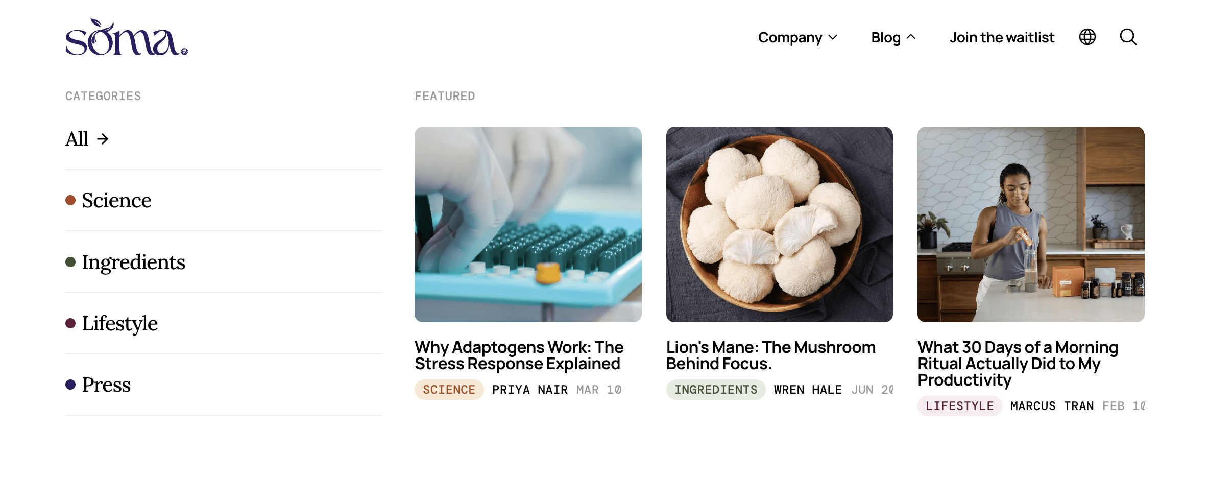
A believable brand requires depth.
To support that, the CMS and blog structure give the brand a place to educate, build authority, and support search visibility over time. The article topics were designed to feel native to the SÒMA. world, blending lifestyle, ingredient education, and wellness science topics in a way that supports the product without feeling like generic content marketing. The FAQ, pricing cards, product specs, and waitlist modal further extend the brand experience, helping the concept feel operational rather than decorative.
Together, these supporting elements help transform the project from a concept website into a functioning digital ecosystem.
Blog Index
A content hub and dropdown within the navigation to support search visibility.
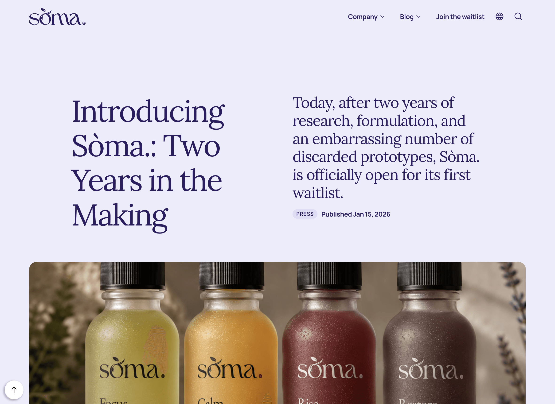
Article Pages
Editorial layouts designed to make educational content feel premium and readable.
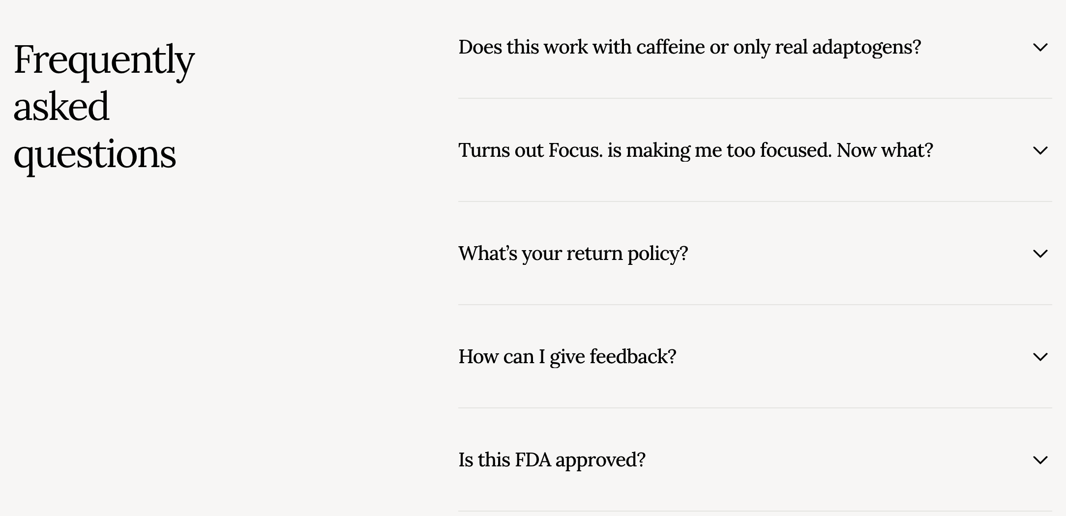
FAQ
Concise answers that reduce friction and support conversion.
Pricing
Subscription-style cards that make the product feel commercially structured.
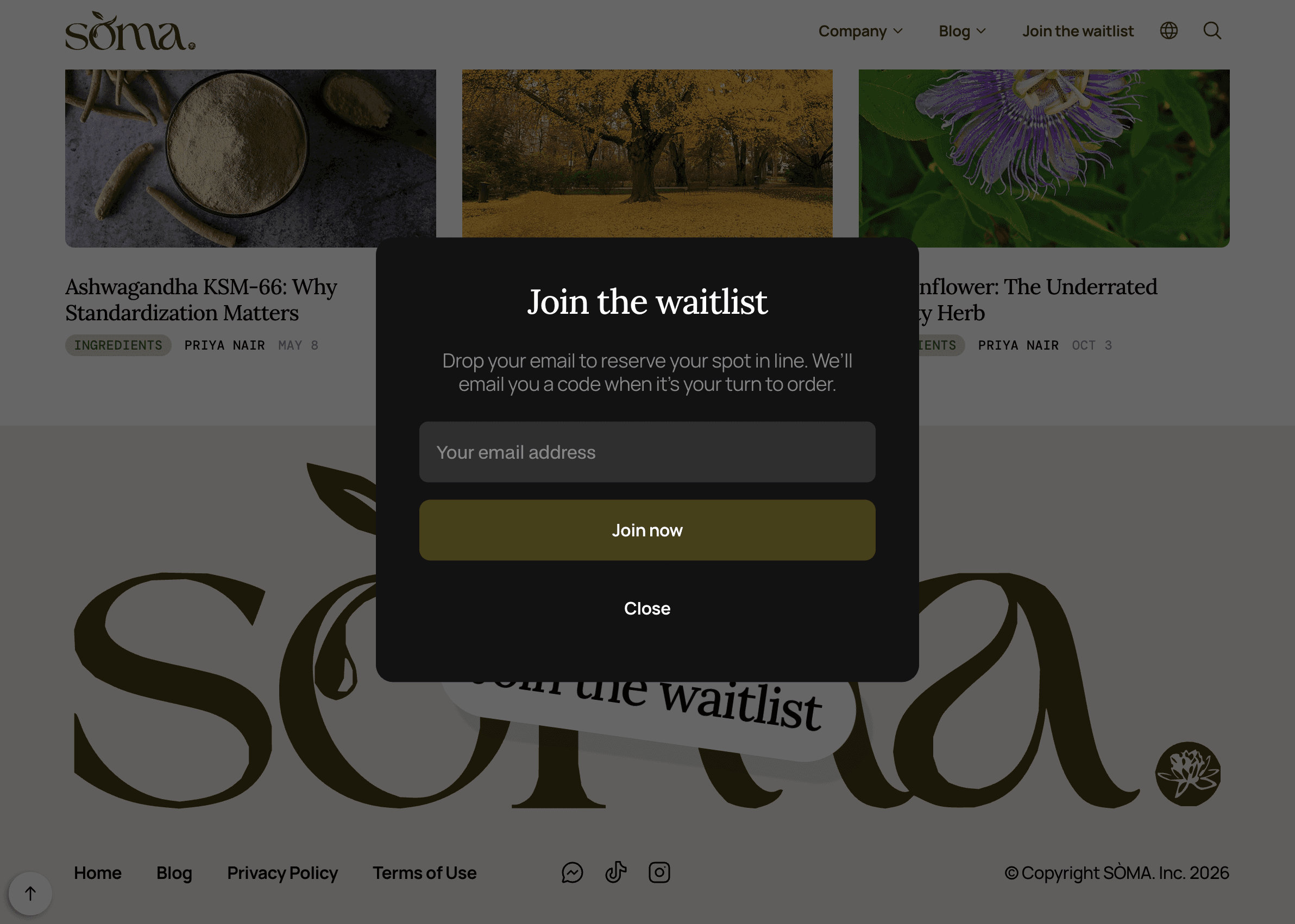
Waitlist Modal
A focused capture flow designed for pre-launch demand.
Bringing It To Life In Framer
Framer was used to bring the concept to life as an interactive, responsive digital experience. The build allowed the project to combine cinematic scroll moments, CMS-driven content, modal interactions, formula storytelling, and responsive layouts within a cohesive visual system. Motion was used selectively as a way to guide attention, create rhythm, and make the product feel more tangible.
Build Features
Scroll-based product animation
Custom interactions
Interactive waitlist modal
CMS/blog structure
Formula and ingredient sections
FAQ accordion
Subscription-style pricing cards
Responsive desktop, tablet, and mobile layouts
Editorial article pages
Product specs section
A System Built To Scale
One of the project's priorities was flexibility. SÒMA.’s digital system was designed capable of conversion and supporting multiple types of content without losing cohesion. Large editorial moments create atmosphere, while structured modules make room for product education, formula comparison, ingredient storytelling, and conversion.
This balance allowed the site to feel immersive without becoming confusing making it expressive enough to stand out, but disciplined enough to support a real customer journey.
Outcome
SÒMA. demonstrates ÉCLOVA's approach to digital experience design at its most comprehensive. What began as a blank canvas evolved into a fully realized concept spanning identity, product strategy, content, interaction design, and development.
The final result is a premium wellness brand that earns attention at first glance and holds it through every layer of the experience.
Outcome Highlights
Two-day focused concept build.
Complete fictional brand concept developed from scratch.
Custom SÒMA. wordmark with botanical glyph and typographic period signature.
Four-formula product architecture created around mood, ritual, and customer intent.
Photorealistic product mockups and original supporting video assets directed for the concept.
Premium Framer website designed with scroll-based storytelling and responsive layouts.
Custom-coded components, CSS overrides, article progress bars, and interactive UI details.
CMS and blog structure containing 54 posts across Science, Ingredients, Lifestyle, and Press.
Supporting FAQ, pricing, product specs, app screens, testimonial carousel, and waitlist flow.
Cohesive brand world spanning strategy, copy, visuals, packaging direction, interaction, and web experience.
Production Note
As a self-initiated concept, supporting visual assets were created and directed specifically for portfolio demonstration purposes.
SÒMA. is a self-initiated concept project created by ÉCLOVA Studio for portfolio demonstration purposes. The brand name, identity system, product concept, copy, visual direction, website design, case study, and related creative materials are original concept materials developed by ÉCLOVA Studio.
No rights are granted to copy, reproduce, adapt, commercialize, manufacture, launch, or otherwise use SÒMA. or any substantially similar expression of the concept as a real product, brand, company, website, campaign, or commercial venture without prior written permission from ÉCLOVA Studio.
For licensing, acquisition, or brand development inquiries, please contact ÉCLOVA Studio directly.
A Fictional Wellness Brand With Real-World Depth
SÒMA started with a simple question:
What would a wellness brand look like if it felt thoughtful rather than trendy?
There was no existing company, product line, packaging, photography, website, or content strategy to build from. Everything had to be created from the ground up, from the formulas and visual identity to the customer journey and digital experience.
What emerged was more than a website. SÒMA. became a fully realized concept brand complete with a product system, editorial content, subscription model, ingredient education, waitlist flow, and a digital experience designed to feel ready for market.
The project became an exercise in building belief: taking an idea that didn't exist and making it feel like it could.
More Than a Website
The objective was never to create a beautiful landing page.
SÒMA. needed enough depth that someone discovering the brand for the first time could understand what it was, why it existed, how the products differed from one another, and what might persuade them to join the waitlist. That meant thinking beyond individual screens.
The identity, product structure, copy, interactions, content system, and conversion flow all needed to support the same story. Every touchpoint had to reinforce the feeling that SÒMA. was a real brand with a clear point of view, rather than just a visual exercise.
The Challenge
Based on research, many wellness brands seem to communicate in extremes. Some lean heavily into science and end up feeling cold and clinical. Others focus so much on lifestyle and aspiration that the product itself becomes difficult to understand. And SÒMA. needed to find a middle ground.
The brand had to feel informed without becoming technical, premium without becoming exclusive, and emotionally engaging without relying on vague wellness language. Because the project was self-initiated, every foundational decision had to be made from scratch: the positioning, product architecture, naming system, visual identity, user experience, content strategy, and interaction design.
The challenge wasn't simply designing a product website.
It was creating enough structure around the idea that the product felt believable. Building trust with the user without over-explaining. Making the experience feel premium, polished, and editorial while still being conversion-focused. Giving the concept operational depth to make the brand feel ready for market.
Organizing Wellness Around Intent
Rather than leading with ingredients, SÒMA. was built around outcomes.
The product line was divided into four formulas: Focus., Calm., Rise., and Restore.; each representing a state someone might want to move toward throughout the day. This approach created a simpler decision-making process for the customer. Visitors don't arrive thinking about adaptogens, amino acids, or botanical extracts. They arrive wanting more clarity, more energy, less stress, or better recovery. And the website reflects this reality by introducing the desired outcome first and highlighting the supporting ingredients second.
Formula System
Formula | Role | Experience |
|---|---|---|
Focus. | Clarity, attention, mental stamina | Sharp, bright, steady |
Calm. | Ease, balance, nervous system support | Warm, grounded, soft |
Rise. | Energy, motivation, daily momentum | Uplifting, active, fresh |
Restore. | Rest, recovery, evening reset | Deep, slow, restorative |
The Signature Interaction
One of the earliest ideas developed for the project became the defining interaction of the site.
As visitors scroll through the introduction, the bottle gradually fills with liquid. It's a simple mechanic, but it changes how the product is experienced. Rather than appearing as a static object on the page, the bottle becomes part of the narrative itself. The interaction also mirrors the brand's core idea: small actions repeated consistently create meaningful change over time.
More importantly, it creates a memorable moment early in the journey, something that helps distinguish SÒMA. from the countless wellness websites built around standard product grids and feature lists.
Purpose: To create a memorable opening moment that immediately separates the experience from a typical product landing page.
Function: To use motion to introduce the product through feeling, pacing, and visual transformation.
Effect: To make the brand feel immersive and premium without sacrificing clarity.
Identity Direction
SÒMA.’s identity was built to feel calm, intelligent, and refined. Serif typography gives the brand an editorial softness, while muted formula colors create distinction across the product line without disrupting the overall sense of restraint.
The brand avoids the loud neon language often found in functional beverages and the overly clinical minimalism common in supplement brands. Instead, SÒMA. takes a more elevated, warm, and composed approach. However, the goal wasn't to make the brand look luxurious, but rather to make it feel considered.
Identity Highlights
Editorial serif typography using the Lora font creates warmth, sophistication, and a slower visual rhythm.
Muted botanical tones in the color palette support the formulas while keeping the brand world cohesive.
Minimal bottle labels allow each formula color to become part of the product experience.
Soft lifestyle imagery, product-led compositions, and spacious layouts create a premium wellness atmosphere.
The copy balances emotional clarity with grounded product education.
Designing the Journey
The UX was designed around progressive disclosure. Rather than forcing visitors to absorb every detail at once, the site introduces information in layers. Visitors are first introduced to the feeling of the brand before they're asked to evaluate the product itself. As they continue, each section answers a different question.
What is SÒMA?
Who is it for?
Which formula is right for me?
What's inside it?
How does it fit into my routine?
By the time pricing section appears, visitors have already been given enough context to understand the value proposition.
Each section has a clear role in the journey which includes building curiosity, trust, and intent as the visitor moves through the page.
Journey Overview
Atmosphere: Establishes the tone of the brand.
Product Introduction: Explains what SÒMA. is and why it exists.
Formula Discovery: Helps visitors choose based on the state they want to support.
Ingredient Education: Builds trust through structured, digestible information.
Subscription Logic: Presents pricing in a familiar, conversion-ready format.
Waitlist Conversion: Captures interest with a simple, focused launch CTA.
Beyond the Homepage
A believable brand requires depth.
To support that, the CMS and blog structure give the brand a place to educate, build authority, and support search visibility over time. The article topics were designed to feel native to the SÒMA. world, blending lifestyle, ingredient education, and wellness science topics in a way that supports the product without feeling like generic content marketing. The FAQ, pricing cards, product specs, and waitlist modal further extend the brand experience, helping the concept feel operational rather than decorative.
Together, these supporting elements help transform the project from a concept website into a functioning digital ecosystem.
Blog Index
A content hub and dropdown within the navigation to support search visibility.
Article Pages
Editorial layouts designed to make educational content feel premium and readable.
FAQ
Concise answers that reduce friction and support conversion.
Pricing
Subscription-style cards that make the product feel commercially structured.
Waitlist Modal
A focused capture flow designed for pre-launch demand.
Bringing It To Life In Framer
Framer was used to bring the concept to life as an interactive, responsive digital experience. The build allowed the project to combine cinematic scroll moments, CMS-driven content, modal interactions, formula storytelling, and responsive layouts within a cohesive visual system. Motion was used selectively as a way to guide attention, create rhythm, and make the product feel more tangible.
Build Features
Scroll-based product animation
Custom interactions
Interactive waitlist modal
CMS/blog structure
Formula and ingredient sections
FAQ accordion
Subscription-style pricing cards
Responsive desktop, tablet, and mobile layouts
Editorial article pages
Product specs section
A System Built To Scale
One of the project's priorities was flexibility. SÒMA.’s digital system was designed capable of conversion and supporting multiple types of content without losing cohesion. Large editorial moments create atmosphere, while structured modules make room for product education, formula comparison, ingredient storytelling, and conversion.
This balance allowed the site to feel immersive without becoming confusing making it expressive enough to stand out, but disciplined enough to support a real customer journey.
Outcome
SÒMA. demonstrates ÉCLOVA's approach to digital experience design at its most comprehensive. What began as a blank canvas evolved into a fully realized concept spanning identity, product strategy, content, interaction design, and development.
The final result is a premium wellness brand that earns attention at first glance and holds it through every layer of the experience.
Outcome Highlights
Two-day focused concept build.
Complete fictional brand concept developed from scratch.
Custom SÒMA. wordmark with botanical glyph and typographic period signature.
Four-formula product architecture created around mood, ritual, and customer intent.
Photorealistic product mockups and original supporting video assets directed for the concept.
Premium Framer website designed with scroll-based storytelling and responsive layouts.
Custom-coded components, CSS overrides, article progress bars, and interactive UI details.
CMS and blog structure containing 54 posts across Science, Ingredients, Lifestyle, and Press.
Supporting FAQ, pricing, product specs, app screens, testimonial carousel, and waitlist flow.
Cohesive brand world spanning strategy, copy, visuals, packaging direction, interaction, and web experience.
Production Note
As a self-initiated concept, supporting visual assets were created and directed specifically for portfolio demonstration purposes.
SÒMA. is a self-initiated concept project created by ÉCLOVA Studio for portfolio demonstration purposes. The brand name, identity system, product concept, copy, visual direction, website design, case study, and related creative materials are original concept materials developed by ÉCLOVA Studio.
No rights are granted to copy, reproduce, adapt, commercialize, manufacture, launch, or otherwise use SÒMA. or any substantially similar expression of the concept as a real product, brand, company, website, campaign, or commercial venture without prior written permission from ÉCLOVA Studio.
For licensing, acquisition, or brand development inquiries, please contact ÉCLOVA Studio directly.
